WHY are the books so colorful?
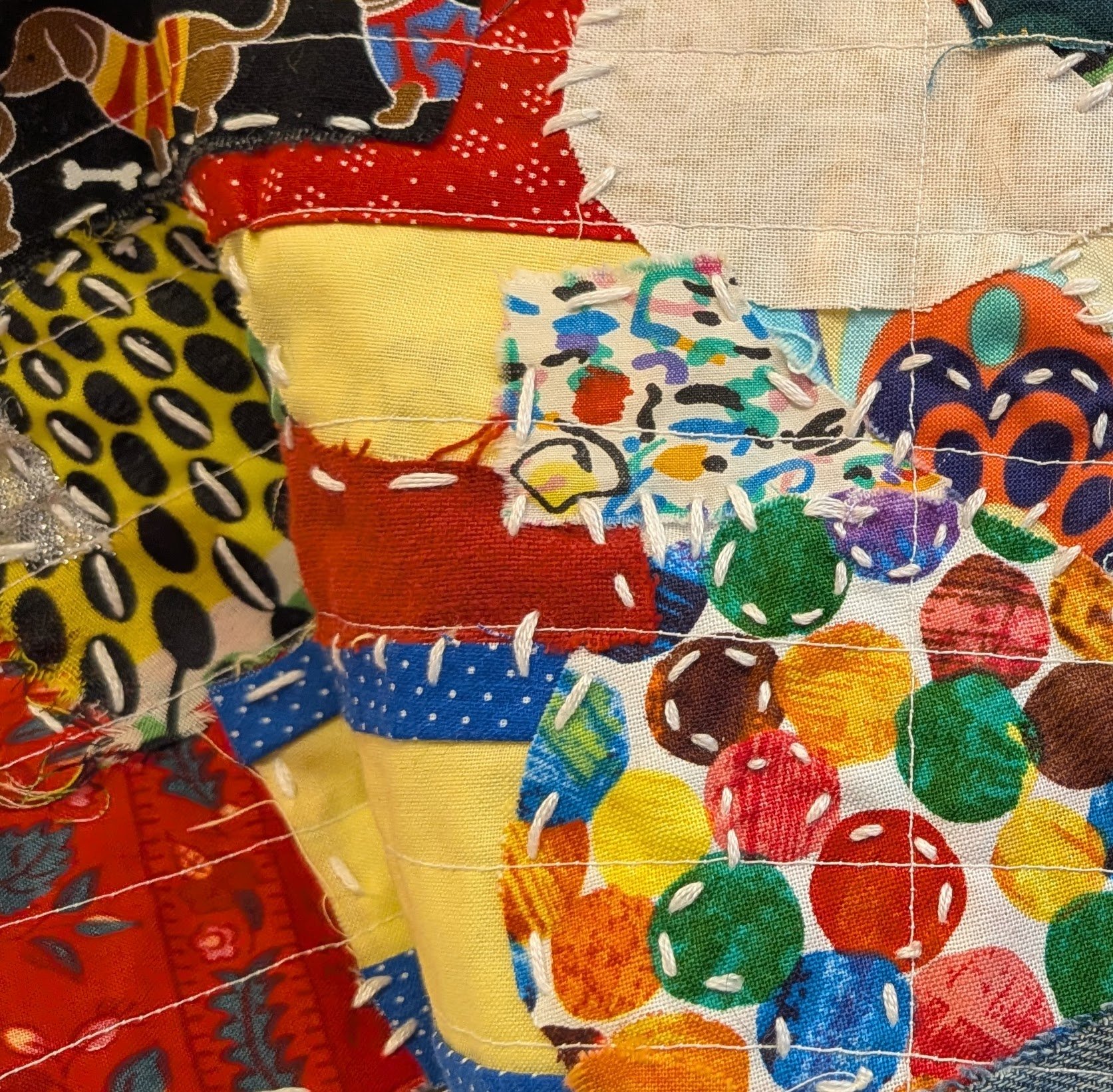
Detail of cover, Volume 7
Someone recently asked me why I use such colorful fabric, given the tragedy of the stories. And a friend’s response to the cover for Volume 7 (detail above), which I stitched together from scraps, was “Joyful!” Both the question and reaction got me thinking again about the connections among the medium, the message, and the purpose of this project. On the one hand, they reinforce each other because sewing is traditionally women’s work and has long been used to engage in feminist protest. But, on the other hand, the bold, cheery, almost child-like color palette of the books clashes with these horrific stories of state-sponsored violence. But, to me, that clash works. It is jarring, and that’s what I want the project to be. Jarring. Disturbing. Upsetting. And yet, the bold colors also appeal to my sense of beauty. I am trying to make something beautiful. Here, I reflect on something activist songwriter Miranda Ferriss Jones said (quoted in full elsewhere): “Art as activism is powerful because of its beauty in the face of ugliness.” I intend these books as beautiful gifts to the women whose stories I tell. I think about the women as I design, cut, and stitch for each page. I think about what they endured. With each stitch, I am saying: I know what you went through, and I will remember it, and I hope that through these disturbing, beautiful books, others will, too.